Tag Archives: beds
Bedroom Design: 5 Dreamy Masculine Bedrooms
Post by Tracy Kaler.
Bedrooms commonly come decorated in light neutrals and happy colors such as yellow, soft greens, and pale blues. Often, furnishings might be slim or curvy in line rather than bold and geometric. Design elements like these tend to make a room feel more dainty and feminine. But if you add in darker hues, less pattern, more texture, and furnishings with a modern sensibility, suddenly the space feels more masculine.
Believe it or not, manly-looking rooms aren’t only attractive to men. Some ladies prefer a simpler, contemporary retreat with clean lines, neutrals, or richer colors. We can plainly see how both sexes would feel elegant in these four dreamy bedrooms with masculine décor.
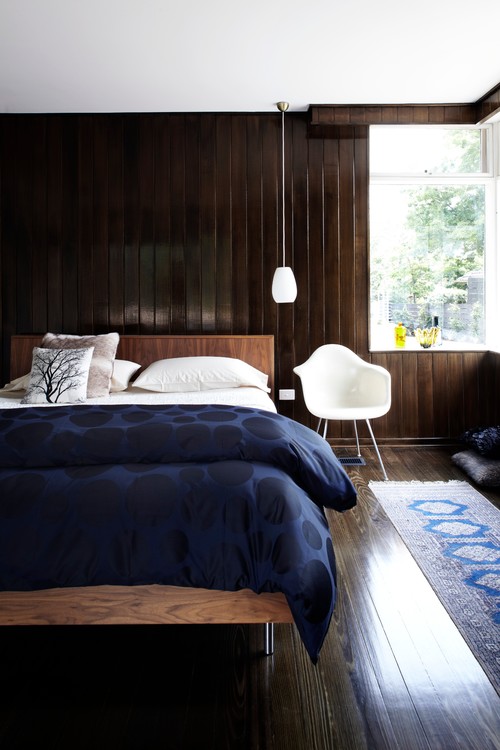
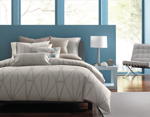
This otherwise sleek sleep space gets its warmth from the deep-colored paneled walls. The navy blue comforter provides contrast, and the throw pillow brings the outside in. A white chair, sconces, and sheets brighten things, while the runner ties the scheme together.
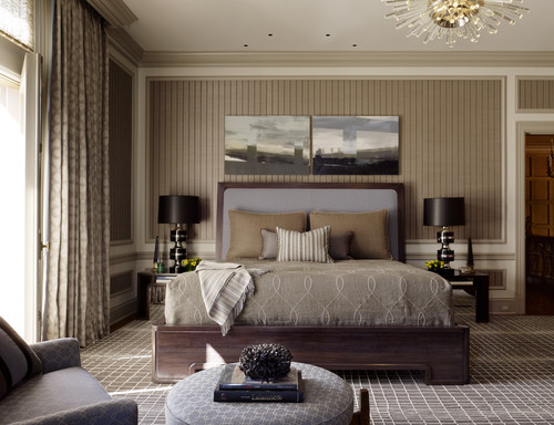
Loaded with texture, this bedroom by Jeffers Design Group proves that neutrals need not be humdrum. The varying shades of grey and brown work beautifully and the space is soothing and inviting.
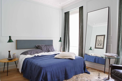
This relaxed Spanish bedroom lacks a headboard but certainly not style. The shag rug, striped shams, unstructured bedding and side panels, no-fuss pendant lamps, and modern furnishings contribute to the masculinity.
This tailored space contains more color than the above choices, but still feels substantial and far from girly. The simple upholstered headboard, touch of paisley, black and white photo above the bed and the Oriental rug, give this “undecorated” room a masculine vibe. Male or female, who wouldn’t love to sleep here?

Sweet Dreams with a Charles P. Rogers Mattress
Post by Tracy Kaler.
Looking to purchase a bed online? You’re in luck. You’ll have an array of choices for shopping from the comfort of home, so you won’t have to sit in traffic or fight crowds when browsing for your next mattress. Here are four top-rated options from Charles P. Rogers that you can purchase online.
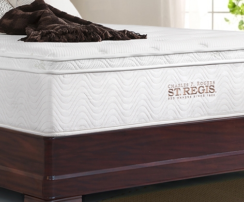
St. Regis
Be prepared for a deep, relaxing night of sleep when you select the St. Regis. You’ll find this mattress similar to those in luxury brand hotels, but with an affordable price. Hypo-allergenic covers enclose layers of high-quality comfort padding around custom innerspring units. Available with standard and low profile foundations, price including a box spring is $1,299.
St. Charles
Pillow-top lovers will find immediate comfort in the St. Charles. Firm yet flexible, this bed is sleeping proof that Charles P. Rogers has kept customers snoozing soundly since 1855. This mattress retails for $699, and you can add a box spring for $200.
Chelsea
Here’s a high-quality, comfy mattress for a daybed. Stable and durable with heavy-duty steel perimeter coils and a full foam border, you’ll get that sumptuous feel without a hefty price tag. The 33-inch daybed mattress sells for $529, and the Chelsea is also available in a twin for the same price.
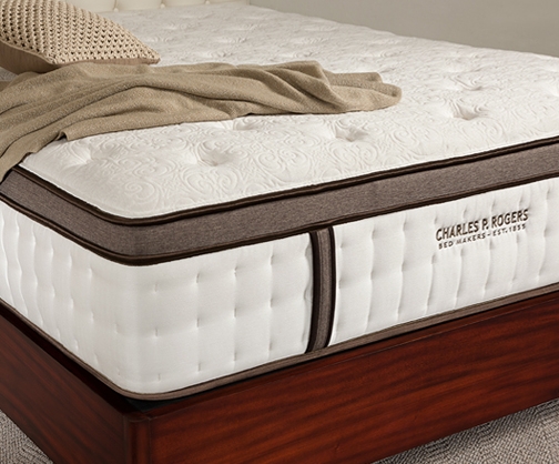
Powercore Estate
Choose from Estate 5000 firm, 7000 Extra Comfort, or 9000 Luxury Plush, depending on your preference. Layers of Talalay Latex pair with a Powercore Mattress Unit to give you one of the best latex mattresses on the market. Retail is $1,899 including a box spring. Try it risk-free for 90 days, and if this isn’t the best bed you’ve ever owned, Charles P. Rogers will buy it back. How’s that for a guarantee?
Sweet dreams!
Bedroom Design: Living Big in a Small Bedroom
Post by Tracy Kaler.
“Small rooms or dwellings discipline the mind; large ones weaken it.”—Leonardo da Vinci
Don’t fret if you lack square footage in your bedroom. Small spaces are no less significant than their larger siblings and still manage to be stylish and chic. Compact rooms are often loaded with personality and give you the opportunity to get creative and explore your inner decorator, so take advantage and don’t feel deprived.
Moreover, a bedroom tends to be especially romantic and peaceful, no matter its size. Whether you prefer traditional or eclectic décor, antiques or modern furnishings (think an Eames lounge chair in your singular empty corner), neutral or bold color accents, bear in mind that an uncluttered design will probably suit any small space best.
Here are four tiny yet delightful bedrooms. Rooms like these make it easy to catch a restful sleep, relax with a favorite read, or just sit back and take it all in.
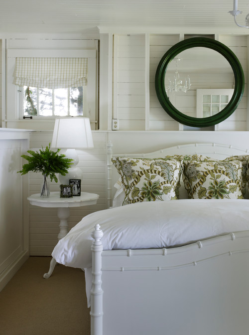
You’ll be in the mood to snuggle in this simple yet elegant, cottage-inspired bedroom. The all-white paneling lends a casual feel, while the poofy duvet makes the bed inviting. Looking at this photo, don’t you want to curl up with a good book?
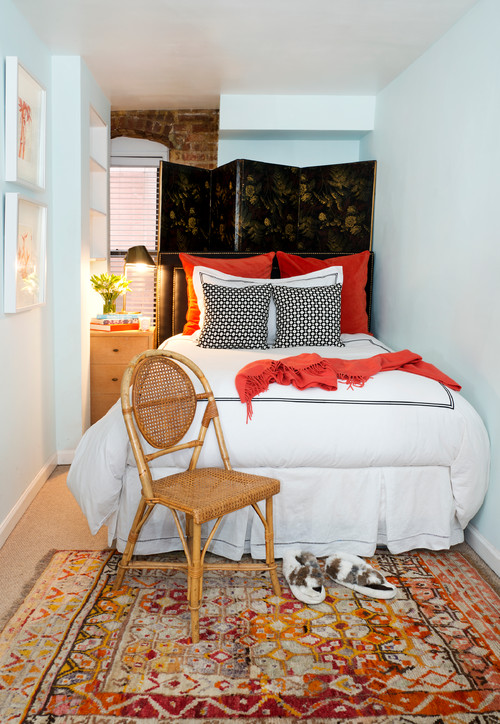
Chinese red textiles and a Persian rug add a boost of color to an otherwise neutral room. A black chinoiserie screen makes for a lovely backdrop behind the leather headboard while crisp linens give this bed a luxury hotel feel.
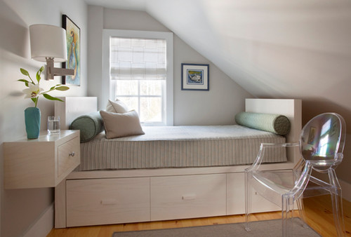
This practical twin bedroom with built-in storage is functional and sleek. The convenient swing-arm sconce allows reading in bed, while the Louis Ghost chair from Philippe Starck breathes a touch of whimsy into the room.
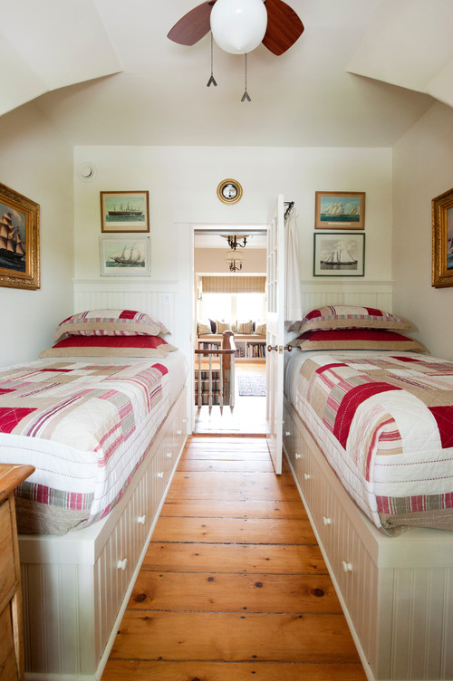
Neatly carved out of a pocket-sized room, this space-saving design works beautifully. Patchwork bedding and knotty pine floors give the room a rustic cabin-like feel. The nautical artwork and ceiling fan enhance the miniature sleeping quarters. This nook could be the ideal child’s room or guest quarters.